off the charts
POLICY INSIGHT
BEYOND THE NUMBERS
BEYOND THE NUMBERS
Thinking About Tax Policy, Part 3: In the Search for More Revenue, Start at the Top
As this series has explained, our unsustainable budget deficits should remain in the forefront of tax policy discussions. Given the need for more revenue, it is fortunate that taxes are low both historically and compared to other countries.
So the next question is: Where should we look first for more revenue?
Trends over recent decades in both income inequality and tax policy strongly suggest that we should start at the top of the income scale. Here’s why:
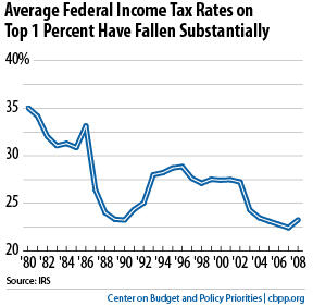
- Taxes at the top have fallen dramatically. The top 1 percent of taxpayers paid an average of about 23 percent of their income in federal income taxes in 2008, IRS data show. That’s far below what they paid prior to President Bush’s tax cuts, and about a third less than they paid back in 1980 (see first graph).Image
- There’s real money at the top. The top 1 percent of taxpayers had a combined income of $1.7 trillion in 2008, the most recent year available, also according to IRS data. This is fully 20 percent of the nation’s total adjusted gross income — and much more than the bottom half of the population had (around 13 percent). Returning the average tax rate on the top 1 percent of taxpayers to its 1996 level of 29 percent could raise about $100 billion a year, or $1 trillion over the next decade.
By itself, of course, that wouldn’t solve the country’s long-term fiscal problems. But $1 trillion over ten years is real money and would make a real dent in the deficit.
- Higher-income people can and should share in the sacrifices needed to reduce long-term deficits. Low- and moderate-income households shouldn’t bear a disproportionate share of the burden through draconian cuts in Medicare, Medicaid, Social Security, and programs targeted on the poor and near-poor.
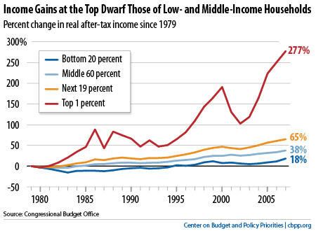
That’s especially true given the sharp rise in income inequality over the last four decades (see second graph).
Image

Receive the latest news and reports from the Center