Today’s Jobs Report in Pictures
http://www.offthechartsblog.org/todays-jobs-report-in-pictures-22/
Posted by: Chad Stone
Posted in: Congressional Action, Economic Recovery Watch, Federal Budget, Recession and Recovery, Unemployment
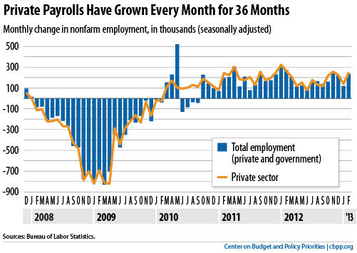
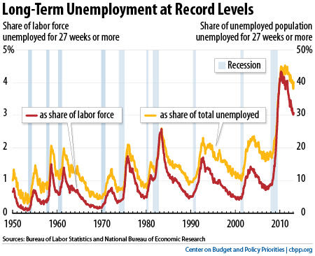
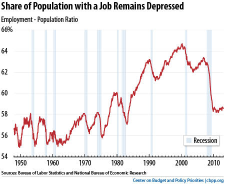
Today’s jobs report shows an encouraging increase in payroll employment of 236,000 jobs in February, but a more complicated picture of unemployment. The unemployment rate edged down to 7.7 percent but the overall labor force shrank by 130,000 people, lowering the labor force participation rate and leaving the share of the population with a job unchanged. Long-term unemployment, which remains at historically high levels, ticked up in February.
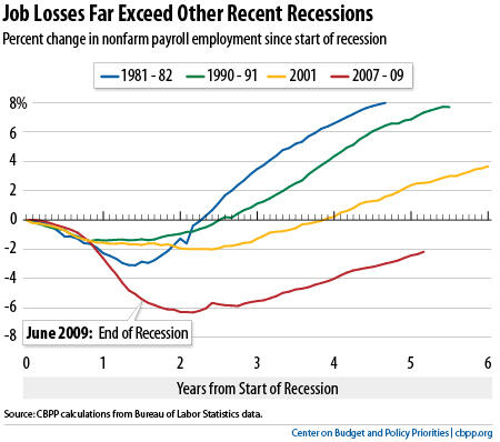
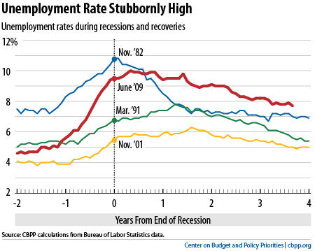
Below are some charts to show how the new figures look in historical context.


Question regarding the relationship of 1981/1982 to 2007/2009 recessions using the following two graphs from above.
#1. “JOb Losses Far Exceed Other Recent Recessions”
#2. “Unemployment Rate Stubornly High”
Both of these graphs use percentages in order to make the comparisons of each event relative to one another, correct?
I can’t wrap my head around how the percentage of job losses can be so much more severe in 2007/2009 than 1981/1982, yet the unemployment rate in 1981/1982 was higher than 2007/2009.
What am I missing here?
Robert,
You are correct that the job loss in each recession is measured on a percentage basis, and the unemployment rate is the number of unemployed as a percentage of the labor force (the number of employed plus the number of unemployed).
In the recent recession the unemployment rate went up more (5.0 percentage points, from 5.0 percent in December 2007 to a peak of 10.0 percent in October 2009) than it did in the 1981-82 recession (3.6 percentage points, from 7.2 percent in July 1981 to 10.8 percent at the end of 1982). In addition, the increase in the unemployment rate in the recent recession was held down by the fact that people dropped out of the labor force rather than continuing to look for work (to be counted as unemployed a person must be actively looking for work). The combination of a steeper rise in the unemployment rate (though not to as high a level as in the 1980s) plus a decline in labor force participation produced a steep decline in the percentage of the population with a job, as shown in the last chart. The severity of that decline mirrors the severity of the job losses shown in the earlier chart.
As a technical matter, the job loss data come from a survey that asks employers how many people they have on their payrolls, while the unemployment rate and labor force participation data come from a different survey that asks households if they are working or looking for work. The Bureau of Labor Statistics explains the differences between the two surveys here: http://www.bls.gov/news.release/empsit.tn.htm