off the charts
POLICY INSIGHT
BEYOND THE NUMBERS
BEYOND THE NUMBERS
The Great Income Shift
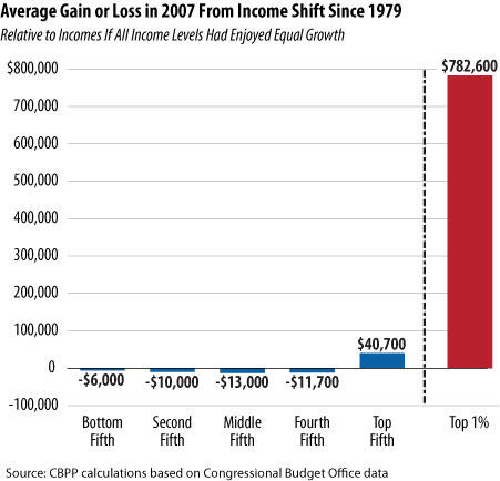
We’ve updated our chart and table on how the change in income distribution between 1979 and 2007 affected different income groups to reflect a slightly different methodology. Below are the revised figures.
For example, the average middle-income American family had $13,000 less after-tax income in 2007, and an average household in the top 1 percent had $782,600 more, than they would have had if incomes of all groups had grown at an equal rate since 1979.
Image
| Impact on Average Incomes of Change in Income Distribution Between 1979 and 2007 |
|||
| Income Group | Actual Average Income in 2007 |
Average Income if All Income Levels Had Enjoyed Equal Growth Since 1979 |
Gain or Loss From Income Shift Since 1979 |
| Bottom Fifth | $17,700 | $23,700 | -$6,000 |
| Second Fifth | $38,000 | $48,000 | -$10,000 |
| Middle Fifth | $55,300 | $68,300 | -$13,000 |
| Fourth Fifth | $77,700 | $89,400 | -$11,700 |
| Top Fifth | $198,300 | $157,600 | $40,700 |
| Top 1 Percent | $1,319,700 | $537,100 | $782,600 |
| Source: CBPP Calculations based on CBO data | |||

CBPP
Receive the latest news and reports from the Center