BEYOND THE NUMBERS
Gini Index Confirms Rising Inequality Over Several Decades
As my colleague Jared Bernstein has noted, yesterday’s Census Bureau report gives further evidence that inequality is worsening. Yet the bureau’s discussion of one measure of inequality, the Gini index, could inadvertently make it sound as if this development was new in 2011. It wasn’t.
Census says, “Based on the Gini index, income inequality increased by 1.6 percent between 2010 and 2011; this represents the first time the Gini index has shown an annual increase since 1993, the earliest year available for comparable measures of income inequality.”
We think that Census meant to say that this was the first statistically significant annual increase in the index since 1993. Yet the trend has been inexorably upward, as the graph shows.
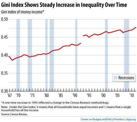
Under the Gini index, zero represents perfect income equality (all households have equal incomes) and 1 represents perfect inequality (one household has all the income). The index has risen in almost every year since 1993, even if its rise in any one year failed to meet the test of statistical significance.
When it comes to inequality, the trend is clear. The United States experienced strong economic growth and shared prosperity for the immediate post-World War II generation, followed by slower growth and growing inequality since the 1970s. And our tax code and government benefit programs do less to offset inequality than many other countries’.
These facts help explain why we need to preserve and improve the safety net, and why we should raise taxes on people at the top as part of a balanced approach to deficit reduction.